
Some of my absolute favorite work includes REST’s annual reports from 2017–2021.
With two annual reports done under REST’s old brand, and three done under the new brand (shown here), there are few things in my career that I am more proud of. I lead these projects from start to finish, gathering data, interviewing survivors, writing, and designing these books. REST’s 2019 Annual Report won a Marcom Award and a Hermes Award for non-profit annual reports.
You can see the PDFs of these reports, including the older ones, and read their content here.


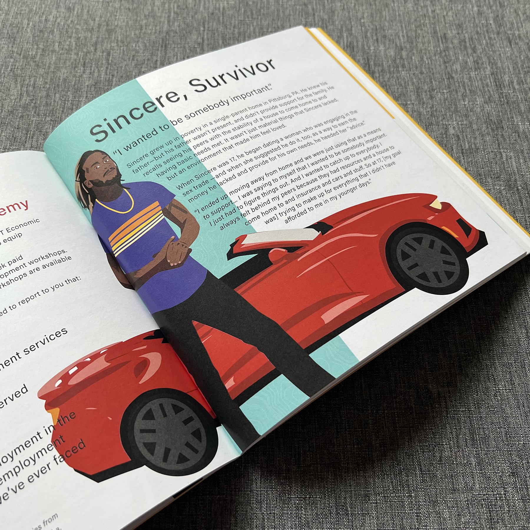
One thing that I truly love about the annual reports is that they each feature at least two survivor stories—most of them feature three or four. It has been a great honor to get to sit with these survivors, hear their story, and get to participate in sharing and amplifying their voices. Learn more about the survivor stories I’ve participated in sharing here.
When REST rebranded in 2019, we worked alongside Belief Agency, with a high degree of survivor input and feedback, to create a brand that reflects the strength, boldness, and tenacity of survivors of sex trafficking. This can be seen in the bright and bold color palettes, as well as the illustrations of survivors by artist Betsy Cauffman. (That’s my kid sister—I’m very proud.)

Amplifying Survivor Voices
One thing I love about the work I got to do at REST was the push for survivor involvement in campaigns. For each of these cards, I had the honor of working with artists who are survivors of sexual exploitation. They were commissioned for the artwork, and I combined their art (and artist’s statements on the back) with the messaging for the campaign. In other campaigns, we shared their recorded voices (no visuals), handwritten messages, or themed quotes to integrate and center survivor voices in our campaigns.

Click the image to see the rest of this blog!
A Night of REST Storytelling Installations
In 2018 and 2019, I got to play a major role in guiding the creation of the immersive installations during cocktail hour at REST’s annual fundraising gala A Night of REST. Both years, we partnered with Artist Reformation (creative direction and art design/installation) and Lance Jacobsen (construction and installation) to bring the stories and voices of survivors to our event attendees, inviting them into some of the experiences of survivors of sex trafficking.
In 2019, we did this by creating two sets of three rooms, each set telling the story of a survivor. I interviewed the survivors whose stories were featured, and worked with them to create a narrative that could be displayed across three rooms, and collaborated with the survivors and Artist Reformation to bring their stories to life in physical spaces.


In 2018, we used large mirrors to invite guests to reflect on the journey from feeling loved to unloved, providing an interactive experience with some of the mirrors. We partnered with survivors and Programs Staff to blend storytelling poetry and data to present to attendees.


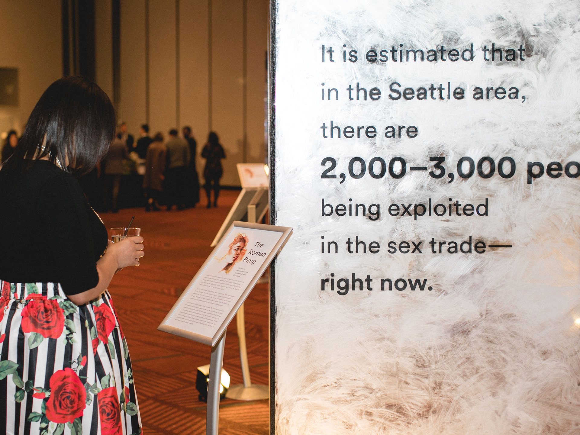

In both of these installations, I designed all of the posters, signage, and vinyl graphics—and even installed the vinyl graphics with the help of volunteers.
Other Work
The vast majority of my favorite work comes from REST. I worked for REST longer than I’ve worked for any other company, and have done work that I care about passionately in my time there. Alas, here are some other pieces I’ve enjoyed creating over the years.

Puck Place Market Women’s Hockey Tournament Shield
A team effort for sure, I got to take the ideas of a fellow board member and bring them to life for our first-ever Puck Place Market Women’s Hockey Tournament. Rooted in a blend of our club colors and Seattle Kraken colors, the shield was a major hit and was highly complimented as players purchased their tourney swag.
Cut Paper Graphics
Ok, this one is also work I did for REST under the old brand—BUT—it was decidedly outside of the brand. Whenever I get the opportunity, I love creating graphics out of cut and scanned paper shapes to create a sense of tactile dimension. In this case, most of the graphic is cut and scanned paper, but the smaller text is digital typography overlayed with paper textures.
Disanka Creative Branding
When a friend was ready to launch his photography business, he came to me for branding. He wanted something that reflected his Congolese heritage, so I did some reading into colors and themes, and we eventually worked out this logo: A cheetah spot, rooted in the yellow color from the national flag of the Democratic Republic of Congo.

Bendable Action Figures
When I was fresh out of college and had no idea how to do business, I designed a series of seven bendable action figures and their packaging (and wrote their stories on the back of the packaging). To this day, I love these toys. They’re out of production now, but they once sold on Amazon, at Fuego stores, and in many of the waterfront gift shops in Seattle. Sometimes when I’m down I go look at the #narwhalicorn hashtag on Instagram to see people enjoying my toy.